Those of you like me who are, already, addicted to Fringe, wunderkind J.J. Abrams’ new FOX paranormal series, are either that’s sooo cooled up or [rolling eyes] give-me-a-breaked out by his show’s location i.d. graphics.
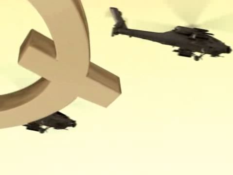
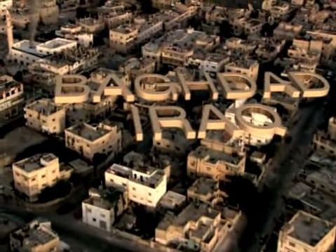
For those who don’t watch the program, airing tonight, whenever the narrative transposes to a new geographic location, the text identifying the spot, as opposed to being chyroned, i.e., character generated, into the bottom of the frame, are, instead, inserted into the landscape, axiometrically. For example, in a flyby of three military helicopters over Bahgdad from the pilot, above, we see the words
BAHGDAD
IRAQ
 hovering immaterially over the buildings, as though left there by a bored giant. Even in the reverse angle, from the ground, right, we catch a glimpse of the Q in IRAQ, staring up from beneath it as though it was an awning.
Super-cool site Panopticist made a big deal about Abrams’ approach to this (“Fringe Typography: J.J. Abrams Still Loves Big Words That Move Toward the Camera.”)
But what I love most is how Toshi Station points out the credit sequence’s more-than-striking resemblance to the one from David Fincher’s Panic Room, below.
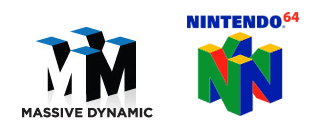
That, and that that Fringe‘s multigabillion, involved-in-everything-from-chocolate-to-neutron-bombs gigacorporation Massive Dynamic was apparently too cheap to do a logo without ripping off Nintendo.


0 comments ↓
There are no comments yet...Kick things off by filling out the form below.
Leave a Comment