Entries Tagged 'Design' ↓
August 3rd, 2009 — Black Music, Design, Hip-Hop
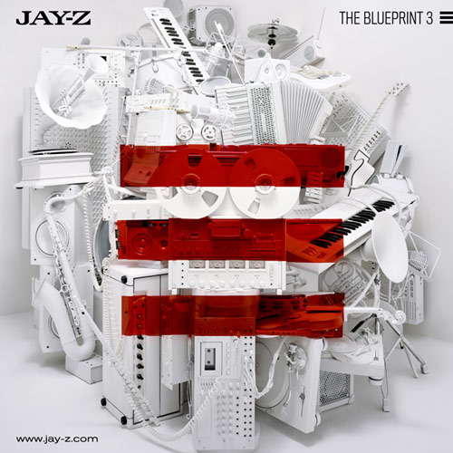
 Did your heart leap with anticipation at today’s release of cover art for Jay-Z’s upcoming The Blueprint III, above? (Or, instead, did you, like one blogger, feel compelled to rant that “that optimising album covers for viewing on iPhones leads to f#&*ing sh!@@y album covers”?) Or maybe your beef is that it “looks EXACTLY like the Secret Machines’ 2004 album cover, Now Here Is Nowhere,” above.
Love it? Hate it? Lemme know!
[via jay-z.com]
July 29th, 2009 — Design, Food
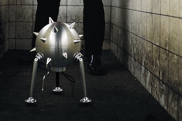
Not only does the Saeco Etienne Louis espresso coffee machine make a great cup o’ java, but, as a neat bonus, it looks like a sci-fi movie prop thermonuclear device.
According to the Google Translate version of the description on Saeco Ettienne’s web site,
The cover of Etienne Louis is a ball made of polished stainless steel from cast aluminum – the foot is taken and the surface of aluminum peaks occupied. All aluminum parts are polished. The upper half of the sphere is removed, your under the water tank to be removed also.
Uh, yeah, right. No price has been given yet, but is any cost too much to both sooth your friends’ taste buds and terrorize them?
[via walyou.com]
July 21st, 2009 — Anime, Design, Entertainment, Fashion, Toys
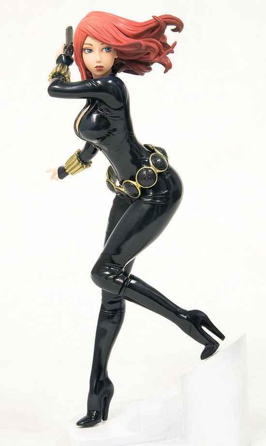
Kotobukiya’s new 1/8-scale Black Widow, above, from Marvel’s Mighty Avengers comics, is the latest in the Japanese master figurine maker’s series of bishoujo or “pretty girl” superheroines. Based on an original design by illustrator Shunya Yamashita, and sculpted by Yu Ishii, the Soviet superspy’s black second skin
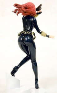 accentuates every curve and the long lines of her legs, which end with stiletto heeled boots. Hugging Natasha Romanoff’s waist is a stylish belt adorned with her red hourglass symbol, and on her arms are golden wristbands. As the sexy spy whips around to look behind her with a pistol at the ready, her intricately carved hair floats in the air behind her. Black Widow stands provocatively atop a specially-designed base.
Constructed from PVC and ABS plastics, 7 3/5 inches tall, Black Widow arrives in an stylish window box, ready to whirl into action. Only $59.99, direct.
[via tomopop.com]
June 18th, 2009 — Design, Humor, Money
 You’ve gotta be giving somebody massively hot, amazing sex to make them even think about wanting to pick up your underwear. Yet, if they look like these numbers here, right, I’m guessing even your lovin’ ain’t that good, bud.
Shomer-Tec, long-time retailers of tools for law enforcement, probably agrees. That’s why they decided that a pair of untidy whiteys might be the world’s best place to stash some cash.
Introducing the Brief Safe,
an innovative diversion safe that can secure your cash, documents, and other small valuables from inquisitive eyes and thieving hands, both at home and when you’re traveling. Items can be hidden right under their noses with these specially-designed briefs which contain a fly-accessed 4″ x 10″ secret compartment with Velcro closure and “special markings” on the lower rear portion. Leave the “Brief Safe” in plain view in your laundry basket or washing machine at home, or in your suitcase in a hotel room – even the most hardened burgler or most curious snoop will “skid” to a screeching halt as soon as they see them. (Wouldn’t you?) Made in USA. One size. Color: white (and brown).
Get the Brief Safe, and take a load off your mind. $11.
[via walyou.com]
June 8th, 2009 — Design, Fashion, Humor, Sex

Finally, after 63 years—children’s toy Rock ‘Em Sock ‘Em Robots were created in the late 1940s—Red Rocker and Blue Bomber have decided to stop fighting…just in time for the “gay marriage” debate. Designer Paul Burgess‘s “Make Love Not War” T-shirt, $18, is available in all sizes from the usual suspects: Threadless.com.
June 3rd, 2009 — Aviation, Design
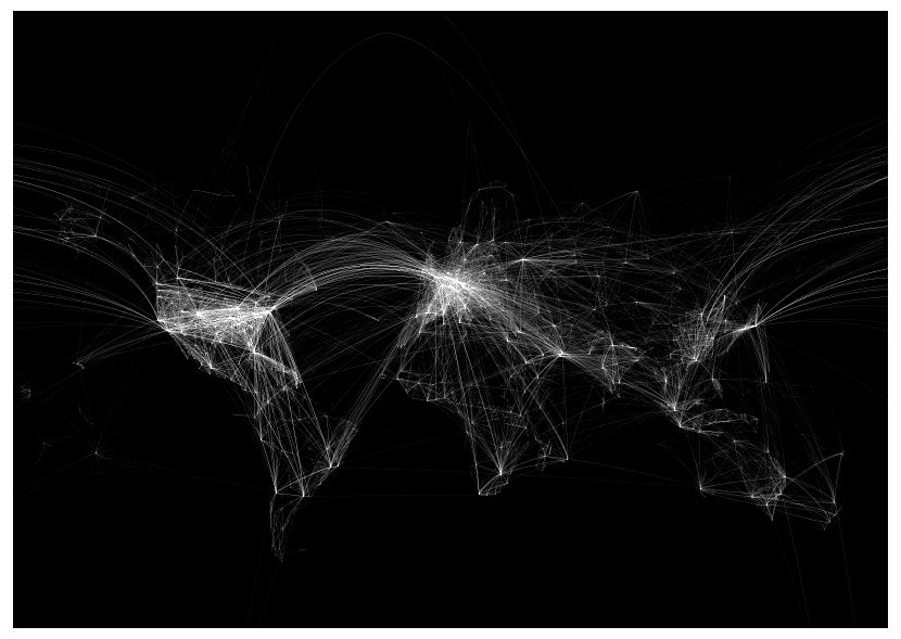
As we post, investigators are still looking for answers to why Air France Flight 447, on its way from Rio de Janiero to Paris, disintegrated, apparently at cruising altitude, off the coast of Brazil Sunday night, certainly killing all 228 people aboard.
In light of the disaster, Mario Freese’s ghostly “Air Lines,” above, serves as either a comfort that these tragedies don’t happen more often, or an alarm as to how likely it is that other calamities may soon follow. Just under 4 feet wide and 3 feet high, the rendering comes either in white on black, as shown, or in extremely limited-edition black on white, printed on heavyweight fine-art paper, and shipped in a mailing tube.
As Freese explains,
Air Lines is an art project showing worldwide airliner routes. Every single scheduled flight on any given day is represented by a fine line from its point of origin to its port of destination. Thereby forming a net of thousands of lines. Hubs like JFK, FRA or DXB turn into dark knots where lines meet, lesser served local services are only are a subtle hint.
 This enlargement, right, of the flight network over Western Europe, gives a sense not only of the larger image’s level of detail, but of the gargantuan energies required to maintain and organize the world’s air traffic. Horrifying as this week’s catastrophe remains, and whether one believes that flying is the safest way to travel or not, one thing all can agree upon is that it could happen a lot more often.
“Air Lines,” 46.8 in. x 33.1 in., $49 postpaid.
[via visualcomplexity.com]
May 27th, 2009 — Black Music, Design, Hip-Hop

Michigan-based graphic designer Logan Walters recently uploaded 21 albums by Wu-Tang Clan and their extended family into his iTunes app. As a working visual artist, however (with “mild OCD” that he blames on his mom), Walters says
I need to have decent-quality album art for every album on my computer, which currently equals over 90 gigs. The problem was that almost all of the Wu-Tang album art was horrible (ODB’s two albums being the only real exceptions) — no offense to the original designers, but as iconic as they might be they’re looking pretty dated these days. So, armed with inspiration from what Olly Moss and others are doing (as written about by me here, and later by Kottke here) and a book of Blue Note Records covers, I set out to remake all 21.
 Thus far, he’s done 12 of these so-called “Wu Note” artwork mashups. His latest, above, reworks the cover of RZA’s 1998 album, Bobby Digital in Stereo, right, replacing its “blaxploitation” palette with the cool hues and playful typography designer Reid Miles fashioned for jazz greats of the 1950s and ’60s. While, to this writer, not all of Walters’ “remixes” are Wu-bangers, these pieces for Ol’ Dirty Bastard’s Return to the 36 Chambers and GZA’s Liquid Swords are a sweet delight. Now, all we need are liner notes. That, and better graphic design in hip-hop.
May 26th, 2009 — Design, Fashion
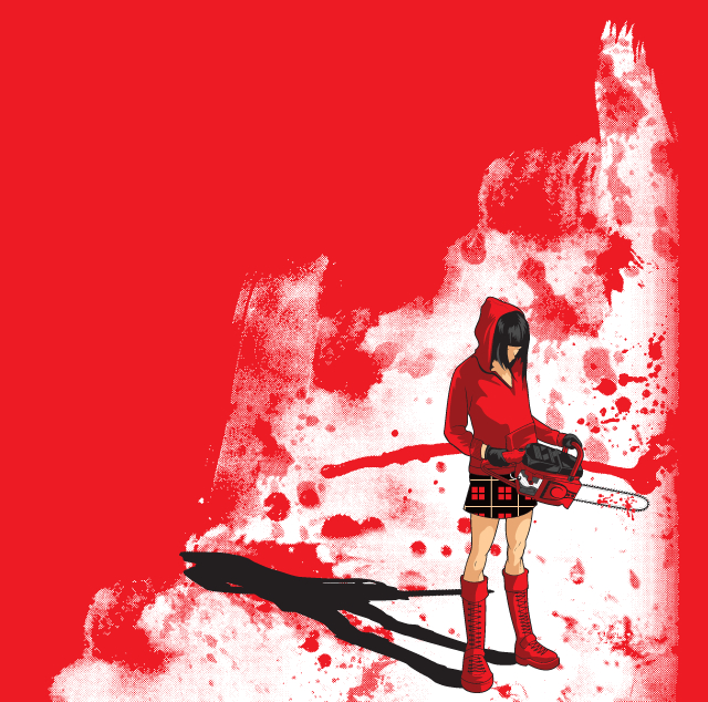
With a single, masterfully-composed image, above, designer Dina Prasetyawan‘s obliquely-titled T-shirt, “The Red”, undoes centuries of fairy tales, recasting storytelling’s most vulnerable victim, Little Red Riding Hood, as a Doc Martened-out, Japanese horror-style psychopath. Given the heft of that chainsaw, and the surrounding drench of blood, I’m guessing the Big Bad Wolf, Grandma, and the Woodsman all got done. Only $18 from Threadless.com.
May 20th, 2009 — Animals, Design, Humor, Photography

He’s called “GreatWhite Clown,” by furfree, one of 48 entries from Worth1000.com’s recent “Animal Clowns” Photoshop competition. Plus, if you think that’s amazing, you should see this guy and 11 of his friends squeeze into a tiny car.
May 8th, 2009 — Books, Business, Design

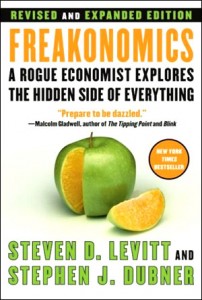 Apparently, the Danish didn’t want to go with the U.S.’s apples-and-oranges cover graphic, right, when they published their cracked yolk version, above, of economist Steven Levitt’s and journalist Stephen J. Dubner’s 2005 smash, Freakonomics: A Rogue Economist Explores the Hidden Side of Everything.
Levitt and Dubner’s treatise on the economics of drug dealing, sumo wrestler cheating, and the effects of abortion on crime has sold over 3 million copies to-date. That kind of worldwide success, you think, would move other countries to tow the line, stay with what works, and, from the look of these other versions, most did. Not the Danes, though…or the British, for that matter, who avoided foodstuffs altogether for both the hardcover and paperback versions of the book.
Why? Hopefully Levitt/Dubner will explain it in their upcoming text, SuperFreakonomics. I kid you not.

 Did your heart leap with anticipation at today’s release of cover art for Jay-Z’s upcoming The Blueprint III, above? (Or, instead, did you, like one blogger, feel compelled to rant that “that optimising album covers for viewing on iPhones leads to f#&*ing sh!@@y album covers”?) Or maybe your beef is that it “looks EXACTLY like the Secret Machines’ 2004 album cover, Now Here Is Nowhere,” above.

 accentuates every curve and the long lines of her legs, which end with stiletto heeled boots. Hugging Natasha Romanoff’s waist is a stylish belt adorned with her red hourglass symbol, and on her arms are golden wristbands. As the sexy spy whips around to look behind her with a pistol at the ready, her intricately carved hair floats in the air behind her. Black Widow stands provocatively atop a specially-designed base.


 This enlargement, right, of the flight network over Western Europe, gives a sense not only of the larger image’s level of detail, but of the gargantuan energies required to maintain and organize the world’s air traffic. Horrifying as this week’s catastrophe remains, and whether one believes that flying is the safest way to travel or not, one thing all can agree upon is that it could happen a lot more often.
 Thus far,


 Apparently, the Danish didn’t want to go with the U.S.’s apples-and-oranges cover graphic, right, when they published