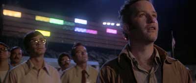
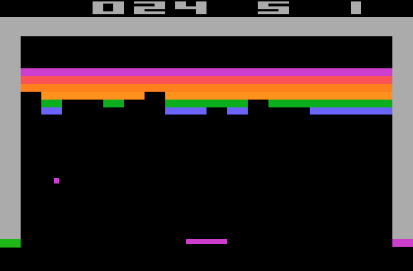
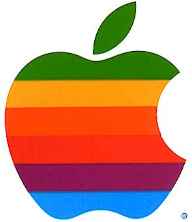
In “The Aesthetics of 1977,” an interesting post from his blog, Dave Troy: Fueled By Randomness, the author discusses how visual designers from that era, particularly ones working around a core set of entertainment products, appeared to imbibe, then spit out, influences.
Maybe it’s just me, but it seems to me that Close Encounters, Atari, Space Invaders, and Star Wars were all linked together with a common visual sense. I think it’s pretty obvious that Atari ripped off Close Encounters for the Space Invaders packaging.
Likewise, the colorful “light organ” used to communicate with the aliens in Close Encounters is a close cousin, visually, to the famous Atari game Breakout. Steve Jobs was one of the designers of the arcade version of Breakout. Note the similarity to the original “rainbow” Apple logo.
He also looks at and compares icons as diverse as Wyoming’s Devil’s Tower, the rendezvous point for the mothership in Close Encounters; the Motorola logo; and Disney’s Space Mountain.
Admittedly, this is the way good designers typically work: Cribbing ideas from other sources, then refining and redefining them until they’re their own. Because of this, cross-pollenization is always hard to prove in visual design, short of an actual admission of it.
But whatever provides seed for an idea, ultimately, nothing may be so enobling as exploring the origins of inspiration, like Troy briefly does here. It would be great if someone were to develop this theme at book-length, in a volume smash-packed with pictures. The visual richness of the 1970s, as a decade, hasn’t even been touched yet.


0 comments ↓
There are no comments yet...Kick things off by filling out the form below.
Leave a Comment